
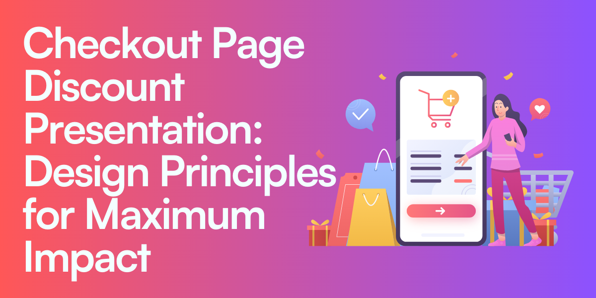
Have you ever wondered why some online shoppers see a discount and instantly click “Buy,” while others hesitate even if the offer is generous? The checkout page can make or break that final decision. This is where your shoppers are most focused on value, trust, and simplicity. If your discount presentation sparks excitement rather than confusion, you’re one step closer to boosting sales. On the other hand, if your discount details are unclear or cluttered, you risk losing a buyer who was so close to completing their purchase.
In this article, we’ll explore the core principles behind designing effective discount presentations on your checkout page. By understanding consumer psychology, layout best practices, and strategic timing, you can create an experience that feels transparent, exciting, and beneficial for your buyers. Ready to learn how to elevate your checkout process? Let’s dive in.
Consumer Psychology of Discounts During Checkout
How do shoppers really think when they see a discount at the final purchase stage? Imagine browsing your favorite online store, adding items to your cart, and feeling a rush of excitement when you spot a special offer. That uplifting feeling, however, can turn sour if the discount isn’t presented in a clear, enticing way. Understanding this moment of truth is vital if you want to secure that conversion.
Decision-Making Processes at Final Purchase Stage
When shoppers reach the checkout, they’re weighing the perceived value against the risk of spending too much or missing out on a better deal elsewhere. Discounts can tip the scale in your favor by showing immediate savings. However, if those savings aren’t easy to understand, customers may hesitate or abandon the cart to rethink their choices.
Perception of Value and Savings
Do you ever see a “50% Off” banner and automatically assume it’s a great deal? That’s the power of perceived value. Even if the final price isn’t massively different, large percentage discounts can appear more enticing. Your goal is to communicate actual savings without overcomplicating the message.
Trust Factors in Discount Acceptance
Sometimes a discount seems too good to be true. If your website or checkout page appears untrustworthy, shoppers may assume there’s a catch—like hidden fees or tricky terms. Highlight trust signals, like secure payment icons and clear policy statements, so your visitors believe your discount is both real and risk-free.
Cognitive Biases Affecting Discount Effectiveness
Loss Aversion and Opportunity Cost: People prefer to avoid losses rather than pursue gains. If they think they’ll lose a discount by leaving your site, they’re more likely to buy.
Anchoring Effect of Original Prices: Showcasing the original price next to the new discounted price can make the discount look more appealing because it creates a visual anchor.
FOMO (Fear of Missing Out) Response: Urgent messages like “Only a few left at this price!” can compel buyers to act immediately.
Now that we know why discounts matter so much at checkout, let’s explore some core design principles to make those discounts shine.
Fundamental Design Principles for Discount Presentation
Think about your own shopping experience. When discounts are clearly displayed, you feel confident in your savings. When they’re hidden or confusing, you might abandon your cart. The following principles ensure your discounts stand out in a good way.
Visibility and Prominence
Font Size and Styling Considerations: Make your discount text bigger or bolder than the surrounding text so it grabs attention.
Color Psychology for Discount Highlighting: Many people associate red or green with savings or deals. Choose colors that match your brand but still pop.
Strategic Use of White Space: Surround the discount details with enough white space to help it stand out from other elements, like product thumbnails or shipping forms.
Clarity and Transparency
Unambiguous Discount Communication: Use simple, direct language like “Save 20%” or “$10 Off.” Avoid wordy phrases that might confuse shoppers.
Avoiding Confusion with Multiple Promotions: If you have multiple deals running, make sure customers can see which discount applies to their purchase.
Clear Distinction Between Original and Discounted Prices: A strikethrough on the original price can be very effective, as long as the difference is instantly noticeable.
Proximity and Context
Placement Near Price Information: Show the discount close to the final total, so shoppers immediately link the promo to their savings.
Relationship to Product Details: If you’re discounting specific items, highlight the deal right next to that product.
Integration with Order Summary: Summarize the discount amount in the order details to drive home exactly how much they’re saving.
Once your layout is clear and transparent, the next step is to decide where, within the checkout process, to present these discounts for maximum impact.
Strategic Placement of Discount Information
Have you ever discovered a discount code field too late, or not at all? Properly placing discount information can reduce frustration and guide shoppers to complete their purchase with confidence.
Optimal Positions Within the Checkout Flow
Pre-Checkout Visibility vs. Checkout Reinforcement: Some stores show the discount early (like on the cart page), while others emphasize it again at checkout. Think about reinforcing the deal so shoppers feel good about their decision all the way through.
Multi-Step Checkout Considerations: If your checkout has several steps, display the discount clearly at each relevant stage, so there’s no confusion about the final price.
Mobile-Specific Placement Strategies: Mobile screens are smaller. Make sure the discount is visible without forcing customers to scroll endlessly.
Discount Code Entry Field Placement
Prominence vs. Discretion Balance: You don’t always want a bright discount code box that encourages shoppers to leave and look for coupons. Consider a subtle link or a collapsible field.
Design Solutions for Promo Code Fields: If you have a dedicated spot for codes, label it clearly with text like “Got a promo code?”
Auto-Apply vs. Manual Entry Considerations: If the discount is automatic, let customers know they’ve already unlocked a deal. If they need a code, show them where to enter it and confirm it worked.
Timing of Discount Presentation
Initial Cart Page vs. Final Checkout Stage: Showing discounts early can motivate shoppers to continue, but a final mention can solidify the sale. Decide which approach feels right for your store.
Progressive Disclosure Techniques: If your offer unlocks after spending a certain amount, show progress bars that update as they add items.
Exit-Intent Discount Strategies: If someone’s about to leave, a pop-up offering a small discount might win them back.
Speaking of design and visibility, let’s look at the visual elements that truly make these offers shine.
Visual Design Elements for Maximum Impact
Your discount presentation isn’t just about where it appears—it’s also about how it looks. Good visuals can spark excitement, while poor design can blend into the background.
Typography and Text Treatments
Strikethrough Original Price Techniques: This is a quick visual cue showing a lower price. Use a subtle but noticeable line so the original price is still readable.
Font Sizing and Weight Hierarchy: Make the discounted price bold or larger than the original price so it jumps out.
Color Contrast for Emphasis: Use a bright color for discounts, ensuring it doesn’t clash with your brand but still grabs attention.
Iconography and Visual Cues
Discount Badges and Labels: A small badge that says “Sale” or “Deal” can draw the eye, especially in product listings or near the checkout total.
Animation and Motion Effects: Be cautious with animation—too much can distract. A short pulse or subtle highlight can be enough.
Visual Indicators of Savings: Some stores add a small note like “You saved $15!” to give shoppers that extra sense of accomplishment.
Layout Considerations
Maintaining Visual Hierarchy: Discounts should not compete with essential buttons like “Pay Now.” Organize your layout so everything is easy to see.
Balancing Attention with Other Checkout Elements: You want your discount to pop, but not overwhelm important details like shipping costs or payment options.
Responsive Design Adaptations: On mobile, stack elements vertically in a way that highlights the discount without pushing other info too far down the page.
With a solid design plan in place, let’s consider what types of discounts you might offer and how to present them effectively.
Types of Discounts and Presentation Strategies
Not all discounts are created equal. Some shoppers react strongly to percentage-based deals, while others prefer a simple dollar-off approach. Understanding each type helps you pick what best fits your products and audience.
Percentage vs. Absolute Discounts
The “Rule of 100” Implementation: If an item’s price is under $100, a percentage might feel more appealing (e.g., 20% off). If it’s over $100, a dollar-off discount (e.g., $25 off) might look bigger and more compelling.
Visual Presentation Differences: Percentages are often seen as exciting, while dollar-off deals are straightforward and easy to calculate.
Context-Appropriate Selection: Choose based on your average order value and what resonates most with your shoppers.
Threshold-Based Discounts
Progress Indicators Toward Minimum Spend: Show how close someone is to free shipping or a higher discount. A small progress bar can work wonders.
Upsell Suggestions to Reach Thresholds: Prompt shoppers to add an extra item if they’re just a few dollars short of a deal.
Dynamic Messaging Based on Cart Value: Update the discount details in real time as the cart grows, making it feel like a game to unlock bigger savings.
Multi-Item and Bundle Discounts
Communicating Complex Discount Structures: If your offer is “Buy 2, get 1 free,” make it super clear which items qualify.
Visual Grouping of Related Items: Show the group discount together, so shoppers know they’re getting a deal on a set.
Clear Presentation of Bundle Savings: Display how much they saved by buying the bundle versus each item separately.
When shoppers see honest, transparent discounts, they’re more likely to trust your store and return. Next, let’s look at how to strengthen that trust even further.
Creating Trust Through Discount Presentation
Trust is the backbone of any successful checkout process. If buyers sense something shady, no discount will be big enough to keep them around. Building trust is about clarity, honesty, and consistency.
Transparency in Discount Calculations
Breakdown of Savings: Show exactly how you arrived at the final price. For instance, list the original price, the discount amount, and the new total.
Clear Totals and Subtotals: Let people see at a glance what they owe, what they’re saving, and any taxes or fees.
Avoiding Hidden Fees or Conditions: Nothing kills trust faster than a surprise charge. Reveal any conditions for your discount (like spending minimums) upfront.
Security and Legitimacy Signals
Trust Badges and Security Indicators: Display SSL certificates, payment security icons, or well-known payment options like PayPal.
Social Proof Elements: Show testimonials or real-time sales notifications to reassure shoppers that others have bought from you.
Terms and Conditions Accessibility: Provide a link to a short, easy-to-read explanation of your discount rules so customers don’t feel caught off guard.
Error Prevention and Recovery
Validation of Discount Codes: If codes are invalid, explain why and show how to fix it.
Clear Error Messaging: Use simple language like “That code is expired. Please try another.”
Alternative Discount Suggestions: If a code fails, you could suggest another active code or a different discount to keep the customer engaged.
Once trust is established, let’s consider the technical side of making sure your discounts work smoothly across devices and platforms.
Technical Implementation Considerations
A visually stunning discount presentation won’t help much if it’s riddled with technical issues. Here are some tips to keep your checkout experience seamless.
Server-Side vs. Client-Side Calculation
If you rely on server-side calculations, your site will be more secure, but it might refresh the page when discounts are applied. Client-side calculations can feel faster, but be sure to secure any discount logic so users can’t exploit it.
Performance Implications of Real-Time Updates
If your page updates discounts in real time, ensure those calculations don’t slow down the checkout process. Shoppers hate waiting, especially right before paying.
Cross-Device and Cross-Platform Consistency
Your discount presentation should look and function well whether someone is shopping on a desktop, mobile phone, or tablet. Test on various devices to ensure consistency.
Accessibility Requirements for Discount Information
Make sure your discount details are easy to read for everyone, including shoppers using screen readers. Descriptive labels and proper markup can make a big difference.
You’ve got the tech down. But how do you know if your discount presentation really works? Let’s move on to testing and optimization.
Testing and Optimization Frameworks
No matter how good your design seems, it’s crucial to test different versions to see what resonates best with your audience. Data-backed decisions lead to stronger results.
A/B Testing Methodologies for Discount Presentation
Create two variations of the same checkout page, each with a different discount layout. Monitor which version leads to higher conversions. Keep everything else the same to ensure valid results.
Key Metrics for Measuring Effectiveness
Conversion Rate Impact: Did your discount strategy encourage more people to complete their purchase?
Average Order Value Effects: Do shoppers buy more items or spend more money with certain types of discounts?
Discount Utilization Analytics: Track how often shoppers apply your discount code or take advantage of auto-applied deals.
Iterative Improvement Processes
User Feedback Collection: Invite customers to share their checkout experience.
Heatmap and Session Recording Analysis: Find out where users click or get stuck.
Data-Driven Design Decisions: Use collected data to refine your discount presentation continuously.
As you refine your discount strategies, remember to integrate them with other crucial parts of the checkout process.
Integrating Discounts with Other Checkout Elements
Discounts don’t exist in a vacuum. They interact with shipping information, payment methods, and loyalty programs. Balancing these elements can create a checkout experience that feels smooth, not cluttered.
Relationship with Shipping Information
Free Shipping Thresholds Presentation: Show how close they are to free shipping if that’s an available perk.
Combined Discount and Shipping Savings: Highlight total savings if they reach a certain spend amount.
Payment Method-Specific Discounts
Highlighting Payment-Related Savings: Some payment providers offer extra cashback or reduced fees. Let shoppers know if they can save more by choosing a specific method.
Design Patterns for Payment Selection: Make it visually clear which payment option unlocks extra benefits.
Loyalty Program Integration
Points Redemption Visualization: If customers can apply loyalty points at checkout, show how those points reduce the total.
Future Rewards Messaging: Remind them they’re also earning points on this purchase.
Tier-Based Discount Presentation: If you have membership levels, show how each tier affects discount eligibility.
Remember to optimize for mobile users, too, since they often have an even bigger chance of abandoning carts due to small screens.
Mobile-Specific Discount Presentation Strategies
Mobile checkout can be tricky. Space is limited, and distractions are plenty. Make your discounts stand out without overwhelming the user.
Space Constraints and Solutions
Use collapsible sections for detailed discount info so the screen doesn’t look cramped. Clear and concise text is vital here.
Touch-Friendly Discount Interactions
Ensure buttons or fields related to discounts are large enough to tap easily. Nobody likes pinching and zooming to apply a promo code.
Progressive Disclosure on Small Screens
Reveal essential details first, then allow shoppers to tap for more information if they need it. This keeps the screen tidy and accessible.
Mobile Payment Integration Considerations
If you offer Apple Pay, Google Pay, or similar services, make sure discounts still show up correctly within those faster checkout flows.
Different industries also have unique challenges and best practices when it comes to discount displays. Let’s quickly explore that.
Industry-Specific Best Practices
Every industry has its own quirks. A grocery store might emphasize bundle savings, while a subscription service might highlight the monthly discount. Let’s look at some examples.
Fashion and Apparel Discount Presentation
Strikethrough prices are common here because fashion items often have higher markups. Buyers want to see the original and discounted price side by side.
Electronics and High-Value Items
Big-ticket items benefit from showing how many dollars shoppers save. Free shipping can also be a major incentive for bulky or expensive tech.
Grocery and Consumables
Bundle deals are key: “Buy 2, Get 1 Free” or “Save $5 when you spend $50.” Make it clear how much they need to spend for that extra value.
Subscription Services and Recurring Billing
Highlight discounted initial months or annual savings compared to monthly rates. Clarity around future billing is essential for trust.
But no matter your niche, personalizing discounts can massively increase their impact. Let’s see how.
Advanced Personalization Techniques
Ever been pleasantly surprised by a discount that felt tailor-made for you? That’s personalization. By focusing on each shopper’s needs and history, you increase your chances of closing the sale.
User-Specific Discount Targeting
Offer unique codes to returning customers or first-time buyers. This personal touch shows you appreciate their loyalty or want to earn their business.
Behavioral-Based Discount Presentation
If someone spends a lot of time on a certain product page, consider a targeted discount or “We saw you eyeing this!” offer at checkout.
Contextual Adjustments Based on Shopping History
Frequent buyers may receive smaller but steady discounts, while new customers might need a more enticing offer to convert.
Integration with Marketing Automation Systems
Sync your e-commerce platform with email or SMS tools to automatically trigger personalized discounts. This keeps your communication timely and relevant.
If you sell globally, remember that shoppers in different regions can have unique perceptions of discounts and local regulations to follow.
Global and Cultural Considerations
Running promotions across multiple countries introduces extra layers of complexity, from currency formatting to language nuances.
Currency Display and International Pricing
Show local currency and clarify if your discount applies globally or just in certain regions. Make sure conversion rates are accurate.
Cultural Differences in Discount Perception
In some places, a 50% off sale is normal; in others, it might seem suspicious. Understanding local buying habits can guide you in setting the right offer.
Translation and Localization Best Practices
Translate discount labels and help text carefully. A poorly translated page can break trust, so invest in professional localization if needed.
Regulatory Compliance Across Markets
Different countries have rules about how you can advertise discounts. Make sure you follow local laws and guidelines to avoid penalties.
Looking to the future, new technologies and shopper expectations will shape how discounts are displayed and applied.
Future Trends in Checkout Discount Presentation
The e-commerce world evolves quickly. Staying ahead means anticipating new ways to delight your customers with meaningful discounts.
AI-Driven Personalized Discount Optimization
Advanced algorithms can learn customer behavior and adjust discounts on the fly, offering the perfect deal at the perfect time.
Augmented Reality Integration
Imagine virtually trying on items and seeing real-time discounts appear in your AR interface. This could become a standard feature for some retailers.
Voice Commerce Discount Presentation
With voice shopping on the rise, verbally announcing and confirming discounts could become a key part of the checkout flow.
Zero-Party Data and Preference-Based Discounting
Shoppers willingly share data about their preferences, enabling you to offer more relevant discounts that don’t feel invasive.
Before we wrap up, let’s look at some real-world examples and lessons learned from actual implementations.
Comprehensive Case Studies
Seeing theory in action can spark new ideas for your own store. Here are a few insights from businesses that revamped their checkout pages to highlight discounts effectively.
Successful Checkout Discount Redesigns
Some e-commerce brands doubled their conversions just by making the discount code more noticeable or showing clear savings in the order summary.
Before/After Implementation Results
Stores that once hid their discount code field behind a small link saw a jump in usage when they made it more visible. However, they also noticed more people seeking external coupon sites, so they balanced it with unique codes sent via email.
Lessons Learned from Failed Approaches
One retailer plastered discount banners everywhere, causing confusion about which offer applied. This clutter led to mistrust and lower conversions, proving that clarity often beats sheer volume of promos.
Innovative Examples from Market Leaders
Big brands use advanced techniques like showing real-time savings, bundling multiple offers, and personalizing discounts based on past purchases. These strategies have helped them stand out in crowded markets.
Ready to take action? Let’s map out a roadmap for implementing these strategies.
Implementation Roadmap
Executing a checkout discount overhaul can be complex. Following a systematic process helps ensure you don’t miss important details.
Audit and Assessment Framework
Start by identifying where your current discount presentation might be falling short. Analyze your checkout flow, gather customer feedback, and look at your data to see where improvements are most needed.
Prioritization of Discount Presentation Improvements
Focus on quick wins first, like making your discount details more prominent or refining your color choices. Then tackle more advanced changes, such as personalized offers or multi-step checkout integration.
Phased Implementation Strategy
Roll out updates gradually to measure the impact of each change. This helps you isolate what’s working and refine what isn’t.
Continuous Improvement Model
After each phase, review your analytics. Keep testing and adapting because customer behavior and market conditions can shift over time.
Finally, let’s conclude by summarizing key principles and offering a few final thoughts to keep you moving forward.
Conclusion
Checkout page discount presentation can dramatically influence whether someone completes a purchase or abandons their cart. By making your offers visible, transparent, and strategically timed, you respect your customers’ need for clarity and encouragement. At the same time, you protect your brand integrity by avoiding clutter and misleading offers.
If there’s one message to take away, it’s that combining psychology, design, and trust-building techniques leads to a winning formula. Small tweaks—like placing your discount details next to the final total, or showing a brief note on how much shoppers saved—can make a big difference in boosting conversions and average order value.
Looking for a handy tool to manage all these time-limited discounts in one place? Check out Growth Suite in the Shopify App Store. It’s a powerful Shopify app that lets you organize, schedule, and track all your discount campaigns from a single dashboard. Why juggle multiple tools when you can simplify your promotions and keep everything running smoothly with just a few clicks?
Now is the perfect time to enhance your checkout page. Experiment with new ideas, stay open to feedback, and keep evolving your discount strategies for the best possible results.
Conversion Rate Optimization Guide
Shopify Time Limited Offer Guide
Mastering Percentage Discounts in Shopify for Maximum Impact
Fixed Amount Discounts on Shopify: When and How to Use Them Effectively
Leave a Reply